When we talk about the importance of understanding the basic relationship between key indicators in data for business growth, you will agree.
Why?
The key to solving problems is to identify their root cause. This means delving deep to uncover causal factors and their relationship to the issues you are trying to mitigate.
This is where scatter plots come in.
Scatter plots are best for visualizing data to gain insights into causal relationships. Using this insightful and easy-to-understand chart to visualize data won't stress you out or waste your precious time, especially if you're an avid user of Google Sheets.
Yes, you read that right.
Google Sheets comes with very basic scatter plot templates that require a lot of customization to align with your data story.
But fear not, you don't have to give up on this free value-added data visualization tool (Google Sheets). You can enhance it using third-party apps (add-ons) to access highly intuitive and easily explainable scatter plot examples.
This blog will guide you through getting started with this visualization with easy-to-follow steps. You will encounter numerous scatter plot examples to help you quickly start telling your data story. In this blog, you'll learn:
- What is a scatter plot?
- Uses of scatter plots
- Top 5 scatter plot examples and how to create them? A step-by-step guide with scatter plot data
- Different types of scatter plots
- Pros and cons of using scatter plots
If your goal is to elevate your Google Sheets game to an A-level, you don't want to miss the rest of the blog.
Before we introduce the promised scatter plot examples, let's take a look at the definition section.
What is a Scatter Plot?
A scatter plot (also known as a scattergram, scatter graph, or scatter chart) is a visual design that uses Cartesian coordinates to display values as points.
Furthermore, this chart distills the key insights of a set of points along the x- and y-axes.
So when should you use this chart?
Uses of Scatter Plots:
Use scatter plots to compare two key variables in the data to determine their relationship. For example, you can use this chart to track the relationship between click-through rate and conversion metrics in digital marketing.
In this case, you might want to know if an increase in click-through rate (CTR) affects conversion value.
Essentially, you can use scatter plot examples to determine the relationship or correlation between key data points. When you identify the type of relationship between the key indicators you are closely tracking, real analysis emerges. You can use scatter plots to uncover the hidden "causal" relationship between two key variables in the data.
Below are scenarios where you can apply scatter plots to get the most out of your raw data.
- Data has paired variables.
- The dependent variable has multiple values for each graph related to the independent variable.
- There are indications that there is a relationship between the two variables in the data.
How to Create a Scatter Plot in a Few Clicks? Complete Video Guide
Top 5 Scatter Plot Examples and How to Create Them? Step-by-Step Guide with Scatter Plot Data
This section includes numerous scatter plot examples to help you get started with this visualization more quickly.
As we mentioned before, Google Sheets and other free value-added data visualization tools come with very basic Scatter Plot examples. You need to rework these charts, which means spending extra time.
If you find yourself surpassing the basic charts provided by Google Sheets and are looking for hidden insights: try ChartExpo.
ChartExpo is an add-on that you can install in Google Sheets and Excel to access advanced charts like scatter plots.
The charts generated by ChartExpo are very easy to interpret. What's more, it loads over 50 advanced charts that you won't find in free value-added data visualization tools like Excel and Google Sheets. If you want to create a scatter plot in Excel, you can refer to our guide on How to Make a Scatter Plot in Excel.
You don't need to learn programming or coding to use ChartExpo.
In the next section, you will encounter 5 scatter plots created using the scatter plot generator.
Example 1
Imagine you want to analyze the height, weight, and age of school children in your neighborhood. Assume the following data is the data you collected.
| Age | Height | Weight (kg) | Weight Legend |
|-----|--------|-------------|---------------|
| 3 | 2.3 | 6 | Weight |
| 4 | 2.4 | 9 | Weight |
| 5 | 2.5 | 10 | Weight |
| 6 | 3 | 8 | Weight |
| 7 | 3.2 | 7 | Weight |
| 8 | 2.9 | 9 | Weight |
| 9 | 4 | 12 | Weight |
| 10 | 4.5 | 15 | Weight |
| 11 | 4.3 | 18 | Weight |
| 12 | 3.8 | 22 | Weight |
| 13 | 5 | 19 | Weight |
| 14 | 5.7 | 20 | Weight |
To visualize the above data using ChartExpo's scatter plot, follow these simple steps:
1. Open your Google Sheets desktop application.
2. Open the worksheet and click the Add-ons menu button.
3. Click the Open button after displaying the ChartExpo-Best Data Visualization Tool dropdown menu.
4. Click the Create New Chart button.
5. You will see chart tabs of six major categories of spreadsheet charts.
6. Click on the PPC Chart tab to access the scatter plot, as shown above.
Copy data from the table above and paste it into your worksheet.
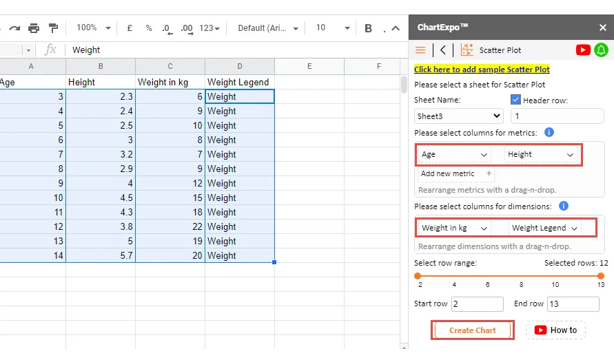
7. Fill in your metrics and dimensions. In our example, we have two metrics, age and height. The dimension variable to be filled is weight (Kg) and weight in the legend.
Your generated chart should look like the image below.
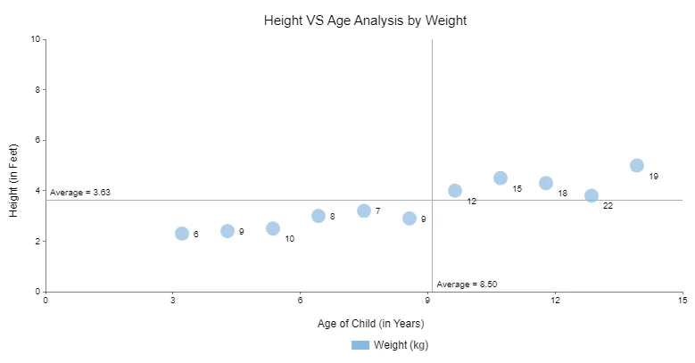
 
Insights:
The height and age of children are positively correlated. In other words, height increases with the child's age. In addition, very few people are below the average line and very few are above the average line.
Example 2
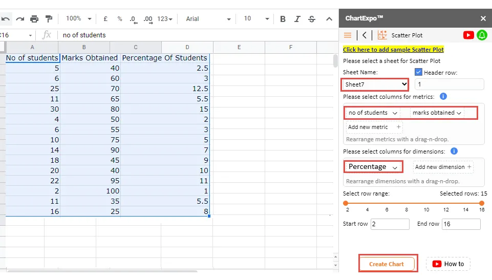
Imagine you want to investigate if there is a correlation between the number of students and their scores.
Suppose the following data is the data you collected.
To visualize the above data using ChartExpo's scatter plot, follow these simple steps:
1. Copy the table above into Google Sheets.
2. Open your Google Sheets desktop application.
3. Open the worksheet and click the Add-ons menu button.
4. Click the Open button after displaying the ChartExpo-Best Data Visualization Tool dropdown menu.
5. Follow the exact instructions we used in Example #1
Fill in the metrics and dimension variables and click the "Create Chart" button. Your final chart should look like the image below.
 
Insights:
- 7 students scored above the average level
- 8 students scored below the average level
- There is no correlation between the number of students and the scores. In the scatter plot example above, these points are scattered everywhere.
- The size of the points represents the percentage of students getting a specific score. The larger the point, the higher the proportion of students getting that score. For example, 15% of students scored 80, while only 1% scored 100.
Example 3
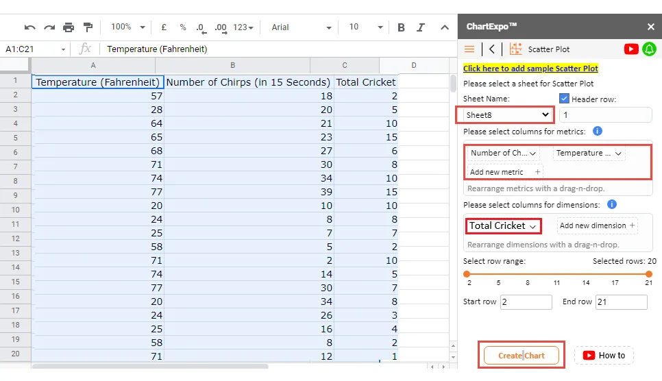
Imagine you want to determine the relationship between outdoor temperature and cricket chirping in your region. Additionally, you have collected enough data samples (assuming the data). Let's visualize the data in a scatter plot example below.
To visualize the above data using ChartExpo's scatter plot, follow these simple steps:
1. Copy the table above into Google Sheets.
2. Open the worksheet and click the Add-ons menu button.
3. Click the Open button after displaying the ChartExpo-Best Data Visualization Tool dropdown menu.
4. Follow the exact instructions we used in Examples #1 and #2
Fill in your metrics and dimension variables and then click the Create Chart button. Your final chart should look like the image below.
 
Insights:
Explaining the scatter plot example above is very straightforward. The x-axis represents the number of chirps, while the y-axis represents the temperature. The size of the points represents the absence of chirping.
Example 4
Imagine you are a retail store owner and you want to assess the relationship between cost, number of orders, and profit. Suppose the table below represents your data.
To visualize the above data using ChartExpo's scatter plot, follow these steps:
1. Copy the table above into Google Sheets.
2. Follow the exact instructions we used in Examples #1 and #2.
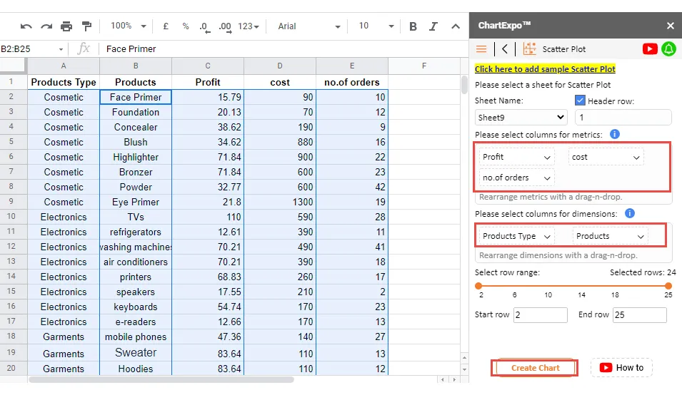
Fill in your metrics and dimension variables as shown above, then click the Create Chart button.
View the final scatter plot (image below).
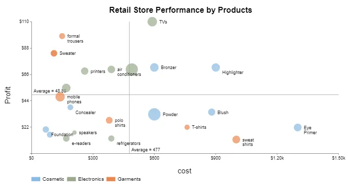
 
Insights:
- All products with profits above the average line are the most profitable.
- Products to the right of the average cost line are losing their profits.
- The size of the points indicates the number of orders.
- There is no correlation between profit and cost. The points are scattered everywhere, without a clear trend.
Example 5
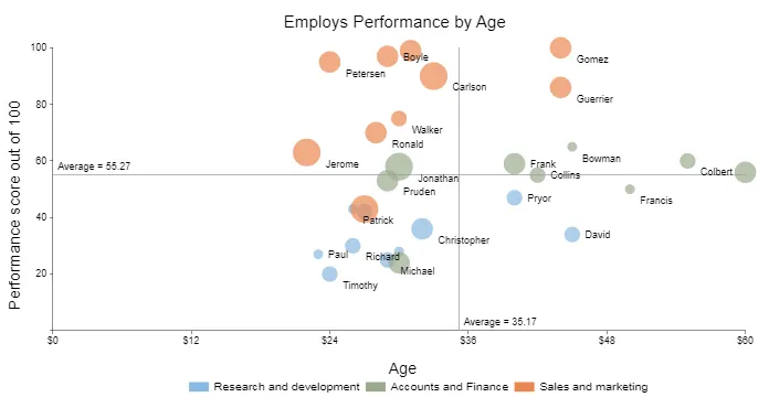
You want to know if there is a correlation between age and performance of employees in different departments within the organization. Assume the following data is the data you collected and you intend to analyze to gain insights.
The size of points in the table below indicates attendance rate (0.1 minimum, 1 maximum).
To visualize the above data using ChartExpo's scatter plot, follow these steps:
1. Copy the table above into Google Sheets.
2. Follow the exact instructions we used in scatter plot examples #1 and #2.
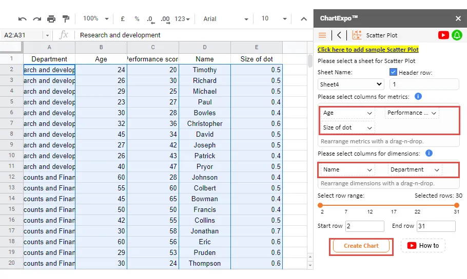
Fill in your metrics and dimension variables as shown above, then click the Create Chart button.
Different Types of Scatter Plots
Scatter plots have different variations based on the following factors:
- Correlation
- Slope
Scatter plots are divided into 3 types based on correlation:
Strong Correlation
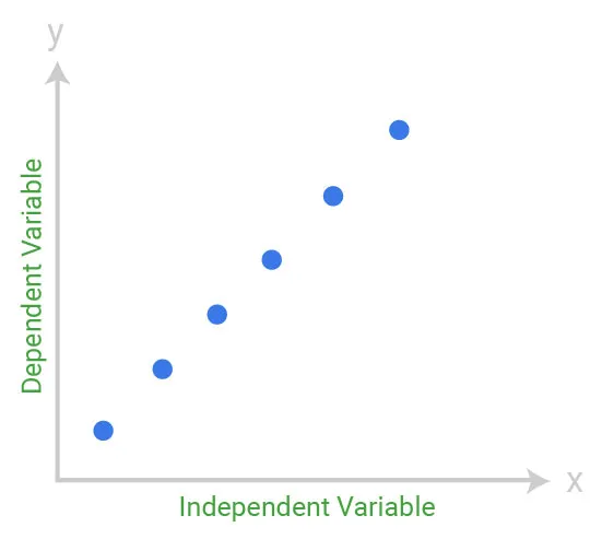
In this scatter plot example, the data points are plotted tightly, following a linear trend. This means there is a strong correlation between the key data points.
Therefore, the above graph qualifies as a scatter plot with a high correlation.
Moderate Correlation
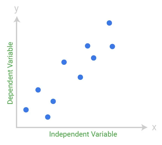
In the above graph, the data points are closer together.
Essentially, there is no complete linearity, which means you can't draw a straight line through them. However, upon close observation, you'll notice the relationship between variables is not significant.
This chart is also called a scatter plot with low correlation.
No Correlation
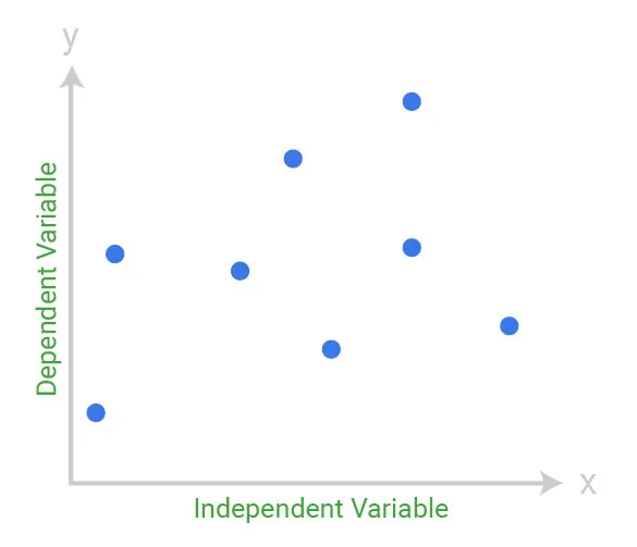
In this scatter plot example, the data points are scattered everywhere. Furthermore, decoding the relationship between data points is not easy.
This data visualization design qualifies as a scatter plot with no correlation.
Keep reading as we take you through numerous scatter plot examples in the next section to simplify everything.
Practical Applications of Scatter Plots
- Showing hidden relationships between two variables
- Identifying correlated relationships
- Identifying data patterns
Use scatter plots to identify hidden correlated relationships in the raw business data.
Explaining scatter plots is very easy.
The key to explaining this chart is to always remember that the independent variable (metric) goes on the horizontal axis (x-axis). And, the dependent variable (metric) goes on the vertical axis (y-axis) of the Cartesian plane.
- Identifying data patterns
Use scatter plots to identify the overall trends of key variables in the raw data.
The data points in this chart are grouped based on the closeness of their values, making it easier to identify outliers. You don't want to base your business decisions on outliers as they can be highly misleading.
Interestingly, the nature of correlation can also be estimated based on a specified level of confidence.
- Positive correlation depicts an upward trend. Essentially, in scatter plots with positive correlation, the data points tilt upwards from the bottom-left corner to the top-right corner.
- Negative correlation depicts a downward trend. The key data points slant downwards from the top-left corner to the bottom right.
- Neither positive nor negative correlation data points are considered as unrelated (empty).
What are the Pros and Cons of Using Scatter Plots?
Every chart you use to visualize raw data has its pros and cons. Scatter plots are no exception. Let's take a look at its pros:
- Scatter plots are important, especially when your goal is to show correlated insights.
- You can use this chart to display the relationship between key indicators in the data.
- Data visualization experts consider scatter plots as an appropriate visual design to display nonlinear relationships in the data.
- Scatter plots are very easy to read, even for non-technical audiences.
- The range of data flow in scatter plot examples is easy to see. This means you can quickly point out the maximum and minimum values in the data.
- Many people think that scatter plots are similar to line graphs, but when you compare scatter plots to line graphs, you'll find these two graphs are different in task.
Remember to take into account some weaknesses related to scatter plots. Let's check them out.
- You cannot use this chart to display the correlation between more than two key variables.
- Only data that you can numerically compare can be best visualized using scatter plots.
- Even though scatter plots reveal hidden relationships in the data, avoid assuming a particular variable is the causal agent of the problem you are trying to solve.
We recommend delving deeper to find more insights to confirm what the scatter plot displays.
Remember that if the chart shows no relationship; investigate if the independent variable (x-axis) has large variations. Why?
Sometimes, due to the small data samples you are working with, the relationship may not be obvious.
What Types of Data Can You Visualize with Scatter Plot Examples?
You can use both continuous and discrete data types with scatter plots. Why?
Continuous data makes it easier to measure trends and relationships between the data. You can choose to use discrete data on one axis and continuous data on the other axis in a scatter plot.
For example: For discrete data, you must put it into some quantifiable range, such as customer satisfaction scores from 1-10.
Frequently Asked Questions:
What is a Scatter Plot?
A scatter plot is a chart that can be used to reveal the hidden relationships between key variables or indicators you are tracking in the data.
The data points in a scatter plot can have the following types of relationships:
- Linear or Nonlinear
- Positive or Negative
- No correlation


