
Creating engaging, relevant, and clear data visualizations for your audience is not an easy task. Experienced data professionals follow best practices to seamlessly complement their data stories with visualizations that make their audience nod in agreement. In today’s blog post, we will take you through 10 tried-and-tested data visualization best practices that experienced professionals diligently follow to create irresistible data stories. So, take some time to steal these golden tips to elevate your data storytelling skills to an A level. Bonus: We have also gathered data visualization color best practices to ensure your charts are 100% clear and informative.
10 Data Visualization Best Practices Every Data Professional Must Follow
Remember, presenting data visually in an engaging way makes it easier to understand. Additionally, our brains process visual effects 60,000 times faster than text. Visuals are more memorable than words. A study found that after three days of a workshop, we may retain 10-20% of written or oral information and up to 65% of visual information. Let’s dive into the content of the blog. Are you ready?
#1: Use Clean Data
Before transforming raw data into charts, you need to clean it. Yes, sparkling clean. So, you need to do what we call data cleansing. What is data cleansing? Well, it’s the process of filtering out any anomalies or inaccuracies in the data. This process is essential because inaccuracies can distort your visualizations. A study by The New York Times found that data scientists spend about 50% to 80% of their time cleaning and organizing data. All of this is done before the actual visualization. This shows how important cleaning data is. You don’t want to use skewed data to generate insights that could mislead your audience. Cleaning data is one of the tried-and-tested data visualization practices you don’t want to skip.
#2: Tailor to a Specific Audience
What does this mean? You need to create visualizations that resonate with your audience. This means you must roll up your sleeves and do a deep dive into understanding their interests, fears, and motivators. Use visualizations tailored to your audience. By doing this, you will create charts with a strategic purpose that can answer specific questions and are easy for the audience to understand. Let’s look at it from the perspective above. Imagine creating a data story for a non-technical audience. Should you use technical charts? No, you need to use charts that are easy to read and understand. You don’t want to overwhelm your audience with cognitive overload. Another thing to avoid is using charts with trend lines. Why? Bombarding your chart with multiple trend lines and other unnecessary elements can distract the audience’s attention. This is the last thing you want. Stick to the Keep It Stupid Simple (KISS) principle. How? Choose simple, easy-to-understand charts that don’t require much effort. Also, avoid including unnecessary information in the charts that may confuse the audience.
#3: Choose the Right Chart
Once your data is clean and ready, choose the best graphic or chart to complement your data story visualization. The charts you use in your data story are crucial because they provide insights. This means that the charts you use in your data story not only seamlessly fit your data story but are also easy to read and explain. Note: The purpose of data visualization is very clear. It is to understand the data and use the information for the benefit of the business. In other words, data can be complex, and when visualized, it adds more value. Essentially, quick communication of data findings is a challenge without visualization. Or identifying patterns for insights and interacting seamlessly with data. Depending on the nature of the data, and more importantly, your goal, choose the best chart for your data story. We have a wide range of charts to choose from. But each chart is best suited for visualizing data with specific attributes. Remember, the overall goal of the data story also helps in selecting the best visualization. For example: – Tables present a large amount of information in an organized way, but they can confuse users looking for advanced patterns. – Line graphs measure changes or patterns over time and show interactions between two or more variables. – Bar graphs evaluate different quantities and totals across different groups. – Scatter plots show the correlation between two variables plotted along two axes, with the patterns of corresponding points indicating their relationship. – Pie charts and donut charts are best suited for visualizing component data added to integers (which can be percentages). – Sankey diagrams are best suited for visualizing processes in your data story.
#4: Label Your Charts
It doesn’t need to be reiterated that charts allow us to quickly identify patterns, trends, and outliers in data. Therefore, you need labels to describe your insights. You don’t want your audience to struggle to identify the head or tail of the chart. You want them to pick out insights as your data story flows. Whether you’re describing experimental setups, introducing new models, or presenting new results, data alone doesn’t answer the questions you need. You need captions to help your audience immediately understand the context of your visualization. Titles explain how to read and interpret your charts. More importantly, they provide additional information about missing variables. Labeling charts should now be part of your checklist. Before presenting your data story to the audience, remember to check this component carefully. We have compiled a small portion of tried-and-tested data visualization best practices for you to follow when labeling charts. You don’t want to skip them.
Labels should be clear and distinguishable. If your labels are unclear, they will not help your data story. So they should be easy to read, most importantly, Give the chart a title. The title provides context for the chart. You don’t want your audience to struggle to incorporate insights. Use legends wisely. Legends make it easier for your audience to see differences between data points in the chart. Label your axes. Titles don’t always convey the labels of axes (x and y). So label them accordingly. Remember, everything you do is for the audience. You already know the labels of x and y axes, but are your audience familiar with them? You don’t want to miss any chance.
#5: Explain Your Charts with Stories
Data visualization is not just about numbers. What is it about? Well, it’s about creating engaging data stories that make the audience nod in agreement. Stories are more convincing than facts and numbers. Remember, words might make your charts cluttered, especially when overused. Use words that support the core insights you intend to communicate through your data story. Another key aspect to remember is clutter and noise in charts. Data visualization is all about making everything simple and clear for the audience. So, avoid unnecessary information that can distract attention from key details. Use titles, subtitles, and annotations to provide descriptive information about your visualization, including key insights.
We have collected some tips for you to steal and use, especially when creating data stories. Take a look at them.
Use simple phrases. The goal is to let the visualization speak for itself.
Only retain annotations that provide relevant information. Adding annotations for every data point will distract your audience and unnecessarily clutter your chart. Use bold or italic text to highlight important parts of the chart. But avoid overusing them. Otherwise, there will be no distinction between regular text and emphasized text. Avoid repetitive text conveying the same information. For example, repetitive titles and subtitles should be avoided. No one likes redundant information. Avoid using distracting hard-to-read fonts. Your audience should be able to effortlessly grasp the information in the chart.
If you follow the best practices we have compiled for you, you will end up with charts that are easy to read and explain. It’s that easy.
#6: Use Predictable Patterns for Layout
We naturally pay attention to patterns and trends. This means we can easily distinguish between rising and falling trends. Also, our eyes are drawn to indicators that tell us important details at a glance. We naturally seek patterns. If the patterns are random or meaningless, it’s hard to understand the message conveyed by the visualization. To take advantage of our natural tendencies, make sure the order in which you present data is meaningful to the audience. Note: We naturally read from left to right. This means you need to position your visualization to comply with the above. Similarly, if you use multiple charts, ensure consistency in order and clarity in connections between data points. You don’t want your audience to get lost in tracking data points or indicators.
Check out the chart below. It’s about market perceptions of brands.
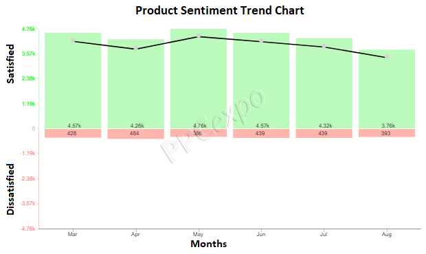
From the above chart, you can easily track customer satisfaction trends over time and see a curved line connecting the bars to show the overall trend in product emotions over time.
#7: Choose the Right Tools
In today’s world, data is gold, but only when you visualize it to gain deeper insights. This means that the tools you use can make or break your data story. You don’t want to use complex or time-consuming tools. A plethora of tools available in the market are either expensive or complex to use. In other words, they require detailed coding knowledge to run them. For creating simple, easy-to-read charts, even for non-technical audiences, we recommend ChartExpo. This is because the tool is very user-friendly and reasonably priced. Additionally, it can generate simple, clear, and insightful charts.
If you want a tool that keeps you confined to data visualization best practices, choose ChartExpo. You can use this tool to visualize business data to improve product interests, marketing strategies, and sales.
#8: Data Visualization Color Best Practices
In the absence of text, color plays a crucial role in communicating insights. Additionally, it affects how our brain processes information. Using color strategically can enhance memory, aid in pattern recognition, and attract attention to key insights. The goal of data visualization is to help the audience quickly digest information and remember it. While other design principles can also play a role (including whitespace, contrast, grouping, etc.), color is one of the easiest principles to apply to data visualization. Using color strategically can help your audience understand the meaning and impact of the presented information. Conversely, using colors improperly can detract attention from your data story.
If you want your audience to effortlessly understand your charts, avoid using heavy and low-contrast colors. More importantly, use colors to highlight key insights that make up the backbone of your story. For example, to differentiate between profitable and unprofitable months in a bar chart, use high-contrast colors such as dark blue and light blue.
We have summarized data visualization color best practices for you to follow when highlighting insights in charts. Check them out below:
– Avoid using the same colors.
– Use colors to create relationships between data points.
– Use the same colors for the same variables.
– Avoid using a single color to display continuous data.
– Use contrasting colors for comparison.
– Clarify what colors represent to the reader.
– Consider the needs of colorblind individuals when selecting colors.
– Avoid using indistinguishable colors.
– Avoid using too many colors in a single chart.
Note: There is always creative space, even in using color in data visualization “rules”. The guiding principle of visualization is to use every element to aid communication. In fact, you’ll find many ways to convey information using color.
Check out the chart below.
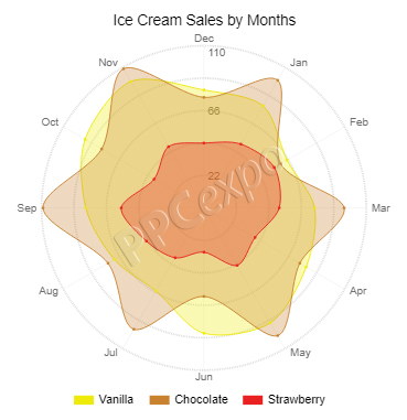
From the above chart, you can easily distinguish two key insights because high-contrast colors were strategically used:
– Best and worst months in the year
– Best and worst flavors
This color combination shows the overall performance of the ice cream shop. The insights generated from the above chart can provide information for marketing strategies to pursue.
#9: Highlight Key Insights
If you want your audience to effortlessly pick out key insights, you must highlight them. Yes, you haven’t read wrong. You don’t want their eyes to struggle to pick out key points. To guide the audience’s attention, use specific visual cues like reference lines or highlighted trends. Remember, our eyes are attracted to symbols that provide valuable details at a glance. For example, when using a bar chart, highlight important bars to help the audience understand the data story. Experienced data visualization experts emphasize the key insights they want the audience to take home. If you want your readers to stay in line with the purpose of the chart, faithfully use this practice.
Let’s dive into the last tried-and-tested data visualization best practice.
#10: Look for Business Insights
Today’s world is competitive. This forces businesses to find answers from data. Merging insights from data with advanced business goals is one of the data visualization best practices. Using data can help you take control before a problem arises. How? Remember, you can use data to predict future trends in your niche market. Have you tried ChartExpo visualization library to add color and distinction to your data?
(FAQ)
What are Data Visualization Best Practices?
Data visualization best practices set standards for the actual presentation of data in charts. If you’re creating charts for an audience, you need to follow data visualization best practices such as:
– Strategically using colors
– Using the appropriate data visualization tools
– Ensuring your data is clean
– Using predictable layout patterns, and so on.
What is Data Visualization, and Why is it Important?
Data visualization provides visual context to your data story for the audience through charts or maps, thus offering profound meaning to them. This makes data more natural and easier to understand. Your audience can easily identify trends, patterns, and outliers in large datasets.
What Are the Benefits of Data Visualization?
The benefits of data visualization include:
– Enhancing message delivery to the audience impactfully and presenting results in the most persuasive way.
– Allowing you to delve deep into vast data easily.
– Empowering businesses to make accurate and profitable decisions.
What Makes Data Visualization More Powerful and Useful?
– Choose the best chart for your data.
– Stick to data visualization best practices.
– Avoid clutter as it masks key insights.
– Strategically use high-contrast colors to guide your audience.
– Utilize labels and legends sufficiently in charts.
– Provide context for your audience.
– Use clear and concise visuals in your charts.
Wrap Up
Congratulations on making it this far successfully. We have summarized 10 data visualization best practices to take your business reports and presentations to a whole new level. But the prerequisite is that you put the pointers into positive use. If you skipped directly to this section, here is a recap of the data visualization best practices tried and tested by experienced professionals to create engaging data stories:
– Use Clean Data
– Tailor to a Specific Audience
– Choose the Right Chart
– Label Your Charts
– Explain Your Charts with Stories
– Use Predictable Layout Patterns
– Choose the Right Tools
– Data Visualization Color Best Practices
– Highlight Key Insights
– Look for Business Insights
If you want to create engaging and irresistible data stories, diligently follow these best practices.
Bonus: Use ChartExpo Visualization to create simple, clear, and easy-to-read charts. This tool will help you comply with the best practices we just discussed.
Which of the 10 data visualization practices do you often follow?