
Research shows that over 2.5 trillion bytes of data are generated every 24 hours in the world today. Yes, you read that right. You can only imagine the amount of data your business generates. While the numbers above may seem staggering, they are growing by the second.
So, how do you extract insights from the ever-growing data? That’s why understanding the most reliable types of data visualization charts to use is worth it. This blog will guide you through the top 5 types of data visualization charts you should try, especially when planning out data stories. You’ll also come across plenty of data visualization design examples to help you get started. If you are looking to take your data storytelling skills to a new level, you don’t want to miss the rest of this blog.
**Using Data Visualization to Tell Stories**
Data visualization is crucial in today’s business environment. Data is the modern-day oil. Yes, you read that right. In order to make the most out of it, you need a reliable strategy and reliable types of data visualization charts. With the exponential growth of data every day, understanding it is a challenging and time-consuming task, especially if you are doing it manually. No industry is exempt from the importance of data. Even the traditionally intuition-based music industry is becoming data-driven.
Data visualization is expanding into various sectors of the economy. As long as there is data, there is a need for data visualization charts. Remember, without a reliable visualization strategy, you won’t be able to create engaging data stories. From website metrics and sales team performance to the results of marketing activities and product adoption rates, your business needs to track a range of key metrics to be successful. You need a quick and effective way to report that keeps everyone on the same page. Do you know the best types of data visualization charts to use? Well, look no further.
Before we dive into some exciting data visualization design types: Let’s look at the benefits of insight-driven charts below.
**Quickly Understand Insights**
As you can use a variety of types of data visualization charts, you can now derive deeper insights faster. Yes, there are plenty of visualization tools in the Software as a Service (SaaS) market, and regardless of the volume and size of data, you can get timely insights. This means if you use these tools 100%, you’ll save a lot of time every workday. Additionally, your productivity will skyrocket. In other words, you can do a lot with minimal time.
**Timely Identification of Patterns and Trends**
You’ll agree with us that identifying trends and patterns in tables and spreadsheets is at best boring and at worst time-consuming. It’s not easy to identify trends and patterns without data visualization design. Some relationships, patterns, and trends are obvious, while others can only be identified with the help of the right charts.
**Telling Data Stories**
In order to get immediate support for your data story, you need to choose the right types of data visualization charts. Remember, your data is very silent without a story to engage the emotions of your target audience. The core of engaging data stories is simple, easy-to-read data visualization design.
**You need to Try the Top 5 Types of Data Visualization Charts**
Here are the top 5 types of data visualization types you shouldn’t overlook when analyzing data.
**1. Scatter Plot**
A scatter plot is a very easy-to-read and understand data visualization design. The primary purpose of a scatter plot is to visualize the relationship between two numerical variables.
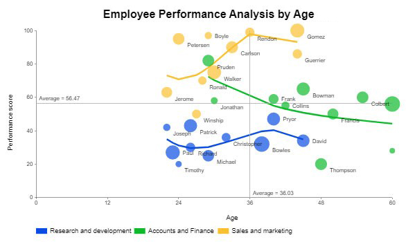
Visualization Source: ChartExpo
Additionally, the dots in a scatter plot depict the values and trends of individual data points when viewed against a larger visual.
**Benefits**
– The scatter plot is one of our recommended data visualization chart types for tracking performance over time.
– You can quickly determine the range of data flow, i.e., the maximum and minimum values in the data.
– Drawing this chart is easy.
**2. Double Bar Chart**
The core principle behind a double bar chart is to show data side by side, which is an important visual cue for our brains to decode comparisons effectively.
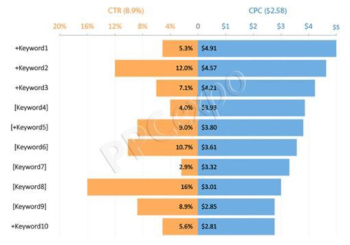
**Benefits**
– The adjacent bar charts are one of the data visualization chart types that are easy to interpret.
– Use these charts if your goal is to create simple side-by-side comparison metrics for advanced insights.
**3. Bar Chart**
A bar chart is one of the very easy-to-read and understand data visualization chart types.
Use these data visualization designs to show how metrics change over time. You can also use it to compare performance metrics over a period.

Visualization Source: ChartExpo
**Benefits**
– Bar charts make it easier to compare different variables in the data.
– Bar charts are the easiest to draw compared to other types of data visualization charts.
– These charts are popular because most people are familiar with them, making them easy to explain.
**4. Stacked Bar Chart**
Stacked bar charts belong to the bar chart family. A standard bar chart compares individual data points to each other. But in a stacked bar chart, parts of the data are adjacent.
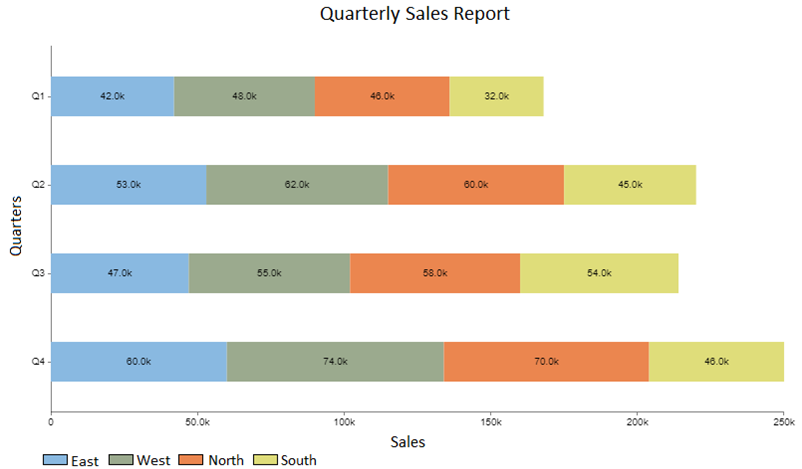
Each section within a bar is the same color. Therefore, this format makes it easy to compare the overall and component parts of each bar.
**Benefits**
– Stacked bar charts are more insightful for comparing data points than combo charts.
– Using this type of data visualization chart makes it easy to identify outliers.
– Explaining this chart is very easy, even for non-technical audiences.
**5. Donut Chart**
A donut chart is almost the same as a pie chart. However, the center of the chart is cut out (hence the name “donut”). Use this chart to visually represent the proportion of categories that make up the overall data.
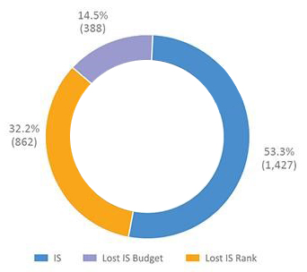
Visualization Source: ChartExpo
**Benefits**
– Donut charts are very easy to read and understand, even for non-technical audiences or readers.
– You can change the data values in this chart to suit your needs.
– You can quickly draw donut charts of different types and colors.
– With text boxes, labels, and legends, you can easily add additional information to help the audience better understand the story.
– Additional information, such as aggregate values, can be placed in the hole of the donut chart.
– These charts are best positioned for comparison between a limited set of categories.
– Donut charts work best, especially when your data is limited.
**Creating Insightful Data Visualization Designs with the Best Tools**
**ChartExpo** is a data visualization tool that goes beyond data. With a full set of tools such as:
– Chart Maker
– Chart Templates
– Data Widgets Library
You can easily create simple, easily readable, and clear charts.
ChartExpo is very easy to use to generate adjacent, donut, stacked bar, scatter plot, bar, and over 80 other types of data visualization charts. It gets better. The tool comes with a library of over 80 charts. The data widgets in ChartExpo are perfect for visualizing map data, tables, percentages, gauges, and more.
Did we mention that you can easily export the charts with various ready-made chart types to create stunning social media reports, sales reports, and target predictions?
ChartExpo is for anyone who needs to create data visualizations and graphs for various purposes. For example, you can create charts for blogs, reports, proposals, school reports, presentations, print, and more.
But most importantly, ChartExpo is designed for those who need to create beautiful charts without any design skills. This highly intuitive tool provides plenty of resources to improve the designer’s vision and make the most of the tools available in the editor.
Whether you need a beautiful chart on its own or as part of a dashboard, report, or proposal? Look no further. ChartExpo is the tool you have been looking for.
**ChartExpo Getting Started**
You **will** install the cloud-hosted plugin in Google Sheets. There are two ways to install the ChartExpo plugin for Google Sheets:
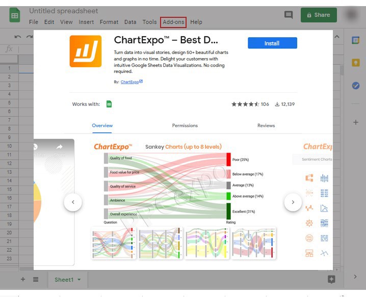
The first method is to visit the Google Workspace Marketplace and enter “ChartExpo” in the search bar.
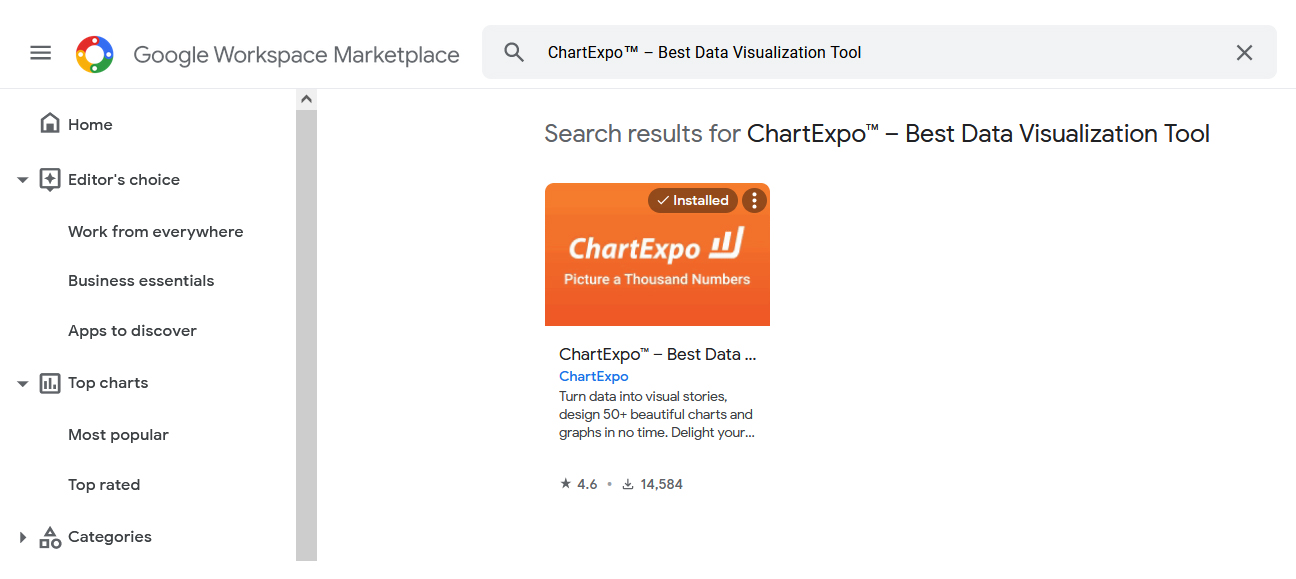
Click on the ChartExpo tool and click the blue install button on the results page.
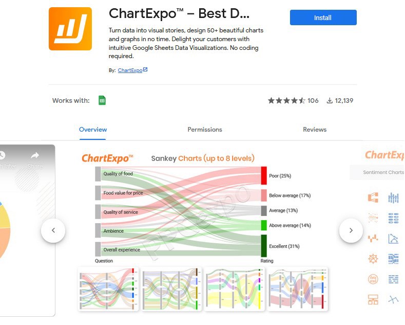
The installation process will begin. Log in to your Google account and grant permission to the plugin.
Once completed, the plugin will be installed and ready to use the next time you open Google Sheets.
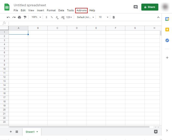
The second method: You can directly download ChartExpo from the Google Sheets App.
To get started, click on the add-ons in the top toolbar.
Follow the option to get add-ons as shown.
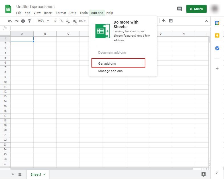
Search for ChartExpo in the bar. When the ChartExpo tool appears in the results, click on it.
Press the blue Install button and grant permission in your Google account.
Open the sheet and click the add-ons menu.
You will see the ChartExpo – Best Data Visualization Tools option in the drop-down menu.
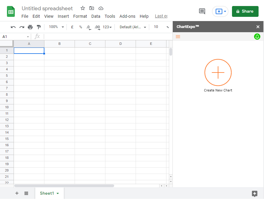
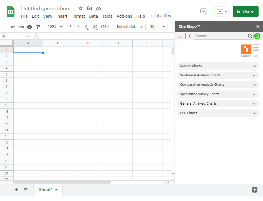
Now click on create a new chart to access 6 types of charts.
Click on the best data visualization chart type for your data story.
**Frequently Asked Questions**
**What Makes a Good Data Visualization?**
A good type of data visualization chart should establish the two aspects of data. Firstly, it should display relationships that are too complex to explain with text in the data. Secondly, it should make your target audience understand data stories and quickly consider suggestions.
**What is the Importance of Charts?**
The main function of charts is to convert raw data into insights to drive business growth and profits. Use charts to create data narratives that emotionally connect with your target audience. Use charts when you cannot quickly analyze tables to get advanced insights.
**What are Data Visualization Tools?**
Data visualization tools are software designed to display insights from raw data. While today’s tools differ in functionality, they allow you to input data and manipulate it visually. Many data visualization design tools available in the market are AI-driven, meaning they are more efficient in handling numerical aspects.
**Wrapping Up**
Congratulations on getting this far on the blog. As we said, to make the most of data, you need the right types of data visualization charts. Why? If you want a quick acceptance, you don’t want your audience to struggle to interpret the meaning and context of data stories. Using the right data visualization design will save you hours every day and enhance your data stories.
Choosing the right chart for your data story doesn’t have to be cumbersome or time-consuming. We recommend to readers the ChartExpo data visualization tool because it has the full set of tools:
– Chart Maker
– Chart Templates
– Data Widgets Library
These features are easy to use. You don’t need coding or programming skills. Additionally, the charts generated are very insightful and easy to read, even for non-technical audiences.
This means you can easily create social media reports, sales reports, and target predictions using this tool. So, whether you want to create engaging data stories or make the most of your data, the ChartExpo plugin caters to all your needs.
Try ChartExpo now to save time on creating custom dashboards for tracking insights.